- Why cartoprodig ?
- Statistical maps
- In the beginning, there is the base map …
- Cartographic representations: stock maps and rate maps …
- Discretizations: dividing a statistical series into classes …
- How to read our maps ?
- The indicators
Why cartoprodig ?
« Generally speaking, maps help to understand the world by providing global representations that are easy to memorise or consult ».
(Béguin M., Pumain D., 2017. La représentation des données géographiques. Statistique et cartographie. 4e éd. Paris, Éditions Armand Colin, 264 p.)
The map has become an indispensable mode of expression, omnipresent on the Internet, in the press, in scientific publications and for the public at large. More effective and easier to access than a text or a table of figures, the (carto)graphic communication tools offer both a synthetic and detailed view of the variations of a phenomenon in space, whether at the scale of a municipality or a region, a country, a continent or the world. At the same time, many international organisations (World Bank, United Nations agencies, UNCTAD, OECD, and others) regularly produce statistics, aggregated at the level of states, on a very large number of themes like education economy, environment, health, migration, etc. These data, which can be downloaded freely, are particularly rich. Taken individually or used in a comparison, they reflect the state of the world at a given moment, as well as the trajectories of countries or continents over several decades. These data, which are widely used in the reports produced by the institutions that produce them as well as in many other publications (in paprticular atlases and school textbooks), are not, however, systematically mapped.
This is what Cartoprodig offers with an original collection of more than 1000 maps using more than 70 statistical indicators produced by a dozen institutions. These maps, all shaped as the same and designed to be easily usable documents, offer a simple treatment of each statistical indicator. This guarantee the reader the validity of the data, the rigour of the treatments and the reliability of the base maps. Cartoprodig is thus a useful resource for researchers, lecturers, students, school teachers, experts, and all those who need simple, reliable maps to illustrate a point or take stock of a situation that can be measured by a statistical indicator. The maps can be downloaded freely in pdf format (ideal for printing) or jpg (ideal for screens).
Statistical maps
In the beginning, there is the base map …
With the aim of producing maps that can be read on a screen and printed on A4 paper, we have built our own base maps with simplified plots, selected spatial features, and projections adapted to the continents (figure 1).

The continental divisions*Note: The boundaries and names shown on the maps available for consultation and download on this site do not imply the expression of any opinion whatsoever on the part of the sources mentioned or the authors of the maps concerning the legal status of the countries and territories shown, or concerning the delimitation of their frontiers or boundaries. The names of the countries shown on the maps are those used by the MEAE, 2020 (data.gouv.fr). are simple and obvious for Africa and America (we have followed the French position of not dividing North America from South America), but our choices may be subject to discussion for Europe, the Near and Middle East, Asia and Oceania. For example, Turkey is included in both the European and Near and Middle Eastern maps, as it seems to us that Turkey is fundamentally linked politically, economically, socio-demographically and culturally to both continental areas. Consequently, its presence in the maps of the two continental blocs seemed to us to be essential for the understanding of the phenomena represented.
On our maps, all the sovereign states (according to the lists of the MEAE (Ministry of Europe and Foreign Affairs) of France and the United Nations in 2020) are represented** Note: The boundaries and names shown on the maps available for consultation and download on this site do not imply the expression of any opinion whatsoever on the part of the sources mentioned or the authors of the maps concerning the legal status of the countries and territories shown, or concerning the delimitation of their frontiers or boundaries. The names of the countries shown on the maps are those used by the MEAE, 2020 (data.gouv.fr)., sometimes in the form of small squares for island micro-states (for example Cape Verde or Samoa) or continental states (such as Monaco or Andorra). On the other hand, we have chosen not to draw the smallest non-sovereign islands and archipelagos (e.g. American Samoa) in order to avoid overloading the base map. Overseas territories attached to states but with various statuses, such as Greenland (a constituent country of the Kingdom of Denmark) or French Guiana (a single-department region of France), are shown with special statistical treatment. In the majority of cases, these territories are covered by a grey colour signifying the absence of data for the indicator in question. On rare occasions, the databases used provide them with their own statistics; in this case, the indicator is only taken into account in the maps of the world and the continent to which these territories belong. Greenland, for example, will therefore be included in the maps of the world and Europe, but covered with a grey colour signifying “out of scope” on the maps of the American continent. Finally, territories with “disputed status” (Western Sahara, Somaliland) appear with grey hatching.
Cartographic representations: stock maps and rate maps …
Most of the maps available on the site are choropleth maps, i.e. with flat areas of colour graded from light to dark. This mode of representation, which is suitable for rates indicators (percentages, synthetic indices, etc.), is not suitable for indicators giving measures of stocks or numbers (national GDP expressed in millions of dollars, population in thousands of inhabitants, etc.). These are represented by circles whose size (in reality the area) varies according to the numbers represented. In this way, it is possible to visually appreciate a proportional relationship between each circle on the map: a circle representing the value 20 will therefore be twice as big as the one representing the value 10.
Discretizations: dividing a statistical series into classes …
The processing of rate indicators requires the statistical series (the set of values for all the countries on a map) to be split (or discretised) into a limited number of classes. We have chosen to apply a simple and unique treatment to all indicators, called Q6 (Figure 2). This method, proposed by Philippe Waniez in the Philcarto® software (http://philcarto.free.fr) and then adopted by Magrit® (http://magrit.cnrs.fr), is based on a division into 4 classes of equal population, after isolating in two extreme classes 5% of the individuals (3 to 10 countries depending on the map) with the highest values and as many individuals with the lowest values (i.e. 6 classes in total). The advantage of this division is that it is independent of the specific values of each indicator, the statistical range (the difference between the minimum and the maximum) and the relative dispersion of the individuals (the countries) over this range. This property makes it easier to compare maps dealing with very different indicators. For example, it is easy to compare the HDI map of African countries with the infant mortality map of the same continent by simply observing the position of a particular country in one class or another, knowing that they are made, in both maps, according to the same procedure (Figure 2, maps A, B and C).
In addition to the collection of maps made according to the Q6 procedure, we propose, for several indicators, other maps adopting specific discretizations, adjusted to the characteristics of the indicators treated. They allow both the integration of benchmark values (for example 0 in growth rates) in the distribution of countries into classes, and the taking into account of the existence of remarkable discontinuities in the distribution of countries (Figure 2, maps C and D) on the scale of values (the range of the statistical series).
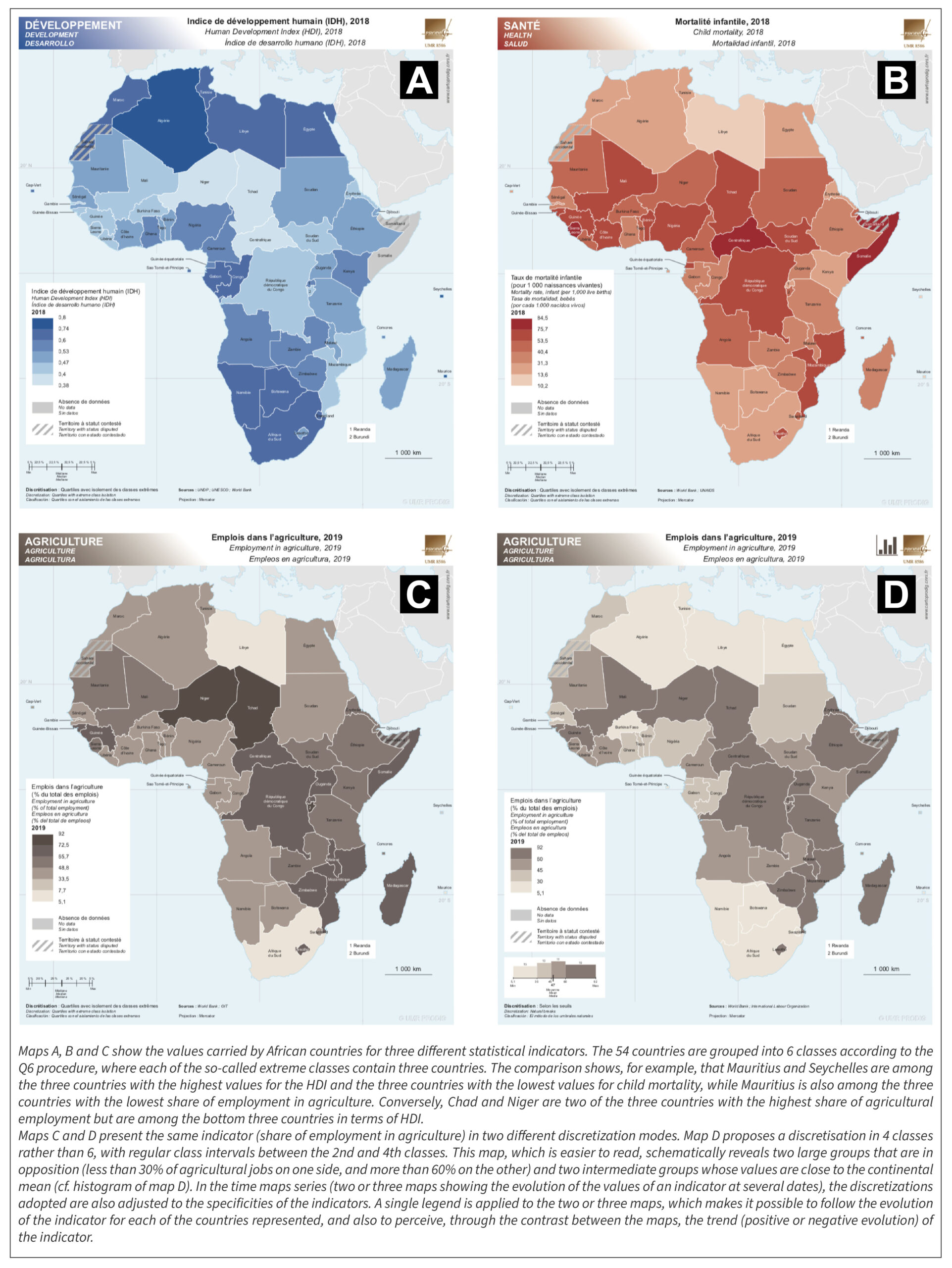
In the time maps series (two or three maps showing the evolution of the values of an indicator at several dates), the discretizations adopted are also adjusted to the specificities of the indicators. A single legend is applied to the two or three maps, which makes it possible to follow the evolution of the indicator for each of the countries represented, and also to perceive, through the contrast between the maps, the trend (positive or negative evolution) of the indicator.

How to read our maps ?

The indicators
The indicators are classified by themes (7) which partly overlap (Figure 5). For example, GDP/capita can be interpreted as a development indicator as well as a “simple” economic indicator. Among the long list of indicators provided by the sources we use, we have given priority to those that we consider to be the most useful and common. Several indicators that are too specific and not very meaningful, or that are very unevenly filled in (i.e. for which a large number of countries do not have values) have been temporarily discarded, such as the rate of pesticide use (in tonnes/ha of agricultural land) or the average annual number of deaths by trauma per 10,000 inhabitants. Similarly, we have focused on processng indicators at the most recent dates (generally from 2014 onwards). In the future, our collection of maps will be complemented by new indicators and by maps of existing indicators at different dates.

* Note: The boundaries and names shown on the maps available for consultation and download on this site do not imply the expression of any opinion whatsoever on the part of the sources mentioned or the authors of the maps concerning the legal status of the countries and territories shown, or concerning the delimitation of their frontiers or boundaries. The names of the countries shown on the maps are those used by the MEAE, 2020 (data.gouv.fr).